After a recent interview with my author friend, she proudly shows me the covers for the next four books in her Christian romance series. My marketer’s eye immediately sees that the designs mimic each other too closely and aren’t distinguishable from one another. Their muddy color palette won’t pop against competitive titles, especially as a thumbnail online.
Wanting to support her success, I provide her some diplomatically worded feedback. Her response falls somewhere in the realm of “Thanks! But that’s okay, I like them.”
And that’s totally fine. Each author has different goals. If her main objective is to please her own aesthetic sense, she has every right to choose that path.
However, if she’d like to reach significant swaths of romance readers, there are some design strategies that can improve her chances of doing so. She could consider using contrasting colors that pop, strong fonts for titles, and relevant genre cues. The real magic materializes in how the design comes together, and the balance of breakthrough (the ability to catch the reader’s eye) with meaning (the appropriateness of a design to convey something about the story’s unique essence).
Although we’ll uncover some design trends in this article, there isn’t only one right answer. Which is why great design really is an art.
Why design?
Why does design matter to writers? Over half our brain is activated by what we see.
“More than 50% of the cortex, the surface of the brain, is devoted to processing visual information,” said David R. Williams, the William G. Allyn Professor of Medical Optics at the University of Rochester.
Design sways our decision-making.
Let’s dive into how cover design can help our books catch attention and reach readers, focusing on romance covers with the help books Goodreads tags as “romance new release.”
Goodreads divides romance into subgenres like historical, contemporary, or romantasy. Cuing your book’s subgenre is helpful to reach readers who know that they love stories in your category.
Historical
Many historical romance covers include design details from the period of history in which their stories take place, effectively transporting readers to long-ago times. Outfits, decor, buildings, even colors are chosen to be appropriate for the book’s time period. The covers also feature figures and images appropriate to the story in each book. Several of the covers obscure the characters’ faces, which is a clever way to allow readers to imagine the characters themselves.
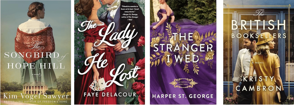
I was excited to see NINC’s very own Harper St. George’s new release highlighted by Goodreads. Her heroine’s luxurious jewel-toned dress is very “on-brand” for her Gilded Age Heiresses series.
Contemporary
Contemporary romance often employs a modern feel through clothing, props, and, oftentimes, the use of bold sans serif fonts (fonts without the extra curlicues). The clean lines of sans serif fonts also stand out well in a sea of other books. In contemporary fiction, we see a large number of books using the trend I dub “Animation Anywhere,” where bold pops of color and illustrated figures remind viewers of cartoon-like visuals. The less detailed images used in animation stand out well in a digital world, where many romance books are sold. Though, on the flip side, some readers feel the “cartoony” look leads them to expect rom-com or more lighthearted fare. As always, the key is to have design set expectations that the book itself will deliver.

It’s all about the title, no extras
Another trend that shows up in contemporary romance is splashing the title right down the full cover. I call this trend “It’s All About the Title, No Extras.” It’s moved from nonfiction to fiction covers and can be effective at breaking through in online worlds.
What gets prioritized on a cover comes from a concept called communications hierarchy. It’s a strategic choice whether to prioritize the author’s name, book title, a central image, or something else.
See how the titles boldly take up the largest amount of front cover real estate in these examples? The contrasting background helps to create an easily readable book title, even if the cover is visible only as a thumbnail on online retailer sites.

Romantasy
Romantasy book covers often include the telltale signs of the fantasy genre: ornate designs, iconic objects, and darker, fiery imagery. Consider how the covers convey a magical feeling through the use of mystical details and the contrast of light with dark. The book Burning Crowns cleverly weaves crown and sword images into its specially designed title font. The Dark Prince conveys mystique through the use of sparkles and fire. This harkens to another trend I’ve written about, “Light It Up,” where designers have electrified covers with bolts of light, neon sparks, and shimmers of gold.
The romantasy genre can appeal to young adult (YA) audiences, so the featured characters may be younger-looking as well, as shown on the Burning Crowns cover.

Partially obscured faces
Not all cover trends are specific to a subgenre. For instance, the partially obscured faces that we discussed in historical romance also can be found in contemporary and other genres. This works well to allow readers to imagine how a character appears in their imagination without creating dissonance with a specific image on the cover. Note that it’s especially easy to execute with the “Animation Anywhere” illustration trend which often obscures details already.

Color of the year
In my marketing roles, I’ve visited color experts and loved hearing about the upcoming color hues which may be expressed in fashion, home décor, and in other consumer goods. The trends often reflect consumer moods or aspirations. This year, well-known color company Pantone selected “Peach Fuzz” as their color of the year, which they say “captures our desire to nurture ourselves and others. It’s a velvety gentle peach tone whose all-embracing spirit enriches mind, body, and soul.”

We can already find this hue embedded in designs, giving the books a range of tonality, from warm to dream-like.

Note that there are no tactical rules that are always true. That’s the same with colors. Design briefs often ask about the concept’s desired tonality. If the tonality is soft, then pastel tones like Peach Fuzz can work. Don’t forget that it’s always a good idea to look at your cover in context with other books in your genre to see if it will stand out while still including enough genre cues that the reader will have a sense of what to expect. Primarily white covers can be hard to pull off, as the color can wash away online against a white screen. But again, there’s no hard-and-fast rule, as multiple nonfiction books use white and still sell well.
It’s better to stay consistent with your strategy and distinctive visual assets rather than chase trends. It’s also important that the “promise” conveyed on the cover matches the experience delivered inside the book. Yet, it’s helpful to be aware of trends, so that your covers don’t inadvertently become outdated or less than optimized for breakthrough. This is why great designers are crucial; they’re trained to know how to artfully combine elements to deliver what each book uniquely needs. Our job as authors is to brief designers well and be great collaborators in the design process. Which is why personally “liking” your book cover design isn’t as effective as analyzing your target audience and assessing the cover against what will appeal to them. If you ever want to learn more on this topic, please join me during one of my marketing talks when I cover “Design as Art: 5 Principles to Spark Brilliant Cover Design!”
Series
Speaking of cover strategy, many romance authors write series, and it’s useful to think of your strategy across a range of books or within a series. Like Harper St. George’s historical romance example, the key is to keep your distinctive visual assets consistent while varying other main elements. This helps you maintain your overall brand look while distinguishing different books in the series from each other. Elle Kennedy’s hockey romance series is an apt example of this. Her book covers display her author name and book title in consistent fonts and placement from book to book, while allowing the figures, title color, and background color combinations to vary from cover to cover. The covers complement each other when placed together, and yet each book is distinct from the others. Well executed, Elle’s designers!

Happy exploring!
So whatever genre or subgenre you write, I hope this article inspired you to observe additional details about cover designs. Next time you’re in a bookstore or placing items into your online shopping cart, see if you notice how designers effectively use animation-like designs, bold fonts, high contrasts of color, utilizing the image of a person without fully showing their face, or specific colors that hint at a book’s tonality.
There are many design approaches that can break through a sea of covers while landing your book’s meaning, and none of the trends we explored are meant to be used in a formulaic way. This is part of the creative aspect of design, just like authorial “voice” can deliver the same story in many ways.
Have fun exploring designs and when you do notice a new trend, please drop me a line and let me know!
________________________

Carol Van Den Hende is the award-winning author of the Goodbye, Orchid series, which draws from her Chinese American heritage and has won 40 literary and design awards. She’s also an MBA with 20-plus years’ experience in marketing, strategy, and insights, who is passionate about simplifying marketing concepts into actionable steps for publishing success.